The Navy Child and Youth Programs asked us to rewrite their E-Library Training page as it was the page that was most visited and consumed
on the navycyp.org website. This page is used by the navy service members and their families to access a variety of
online training courses free of charge. The challenge - I just had one week to design and present it to the team.
PRO TIP - When you have very limited time to deliver, never cut down your research,
cut down on the deliverables instead and resort to more guerilla techniques.
For example, do a quick heuristic evaluation of the product, ask clients to critique the
product, if you're thinking of wireframing, switch to some quick sketching instead, do a
comparative analysis or a journey map, but it needn't be in Illustrator/Photoshop, just
sketch it out and take pictures later.
Here's how I spaced my time:

Heuristic Evaluation and Client Interviews
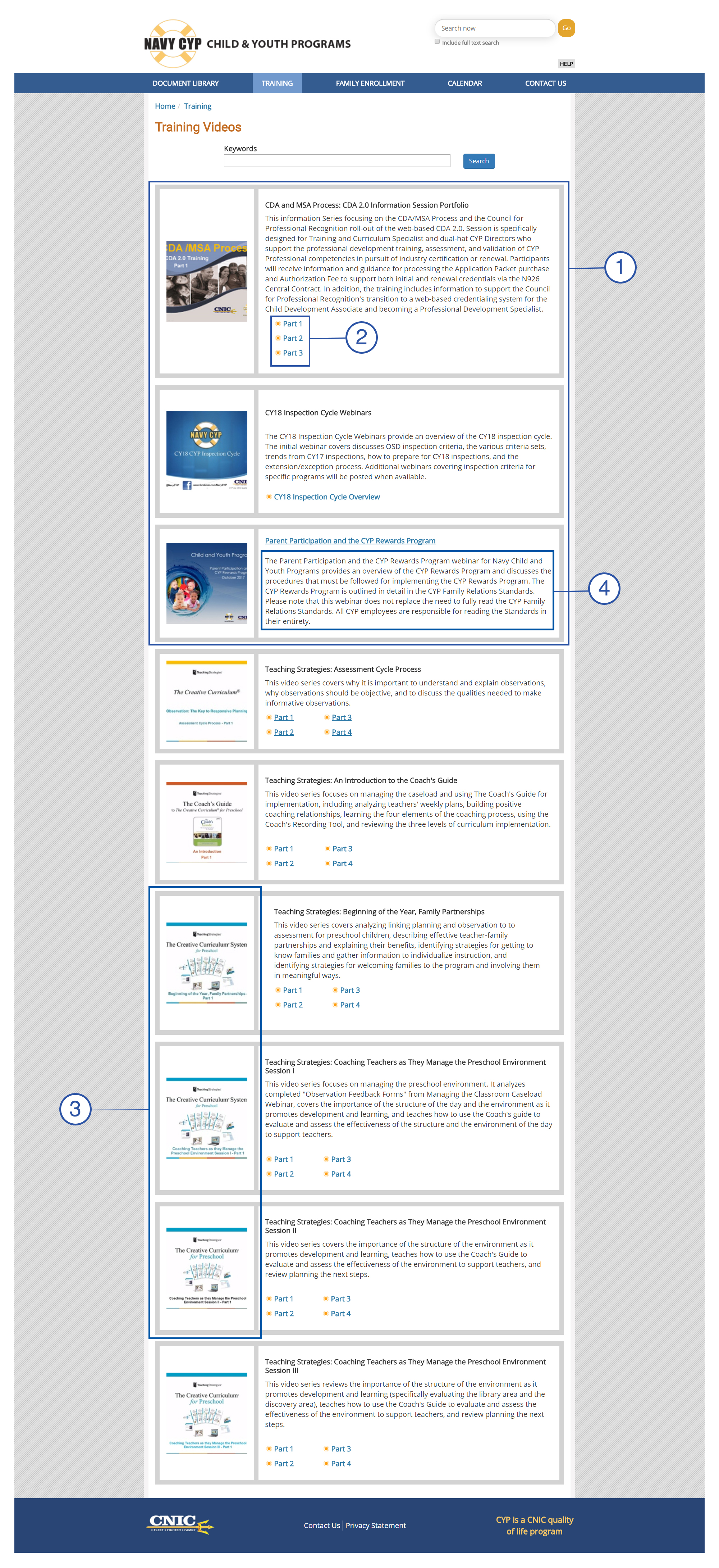
- Each of these cards are of a different height, this violates one of the most important rules of good design - symmetry and structure. The height of each card I directly dependent on amount of content in it. Also, as the number of parts in the video series increase, the height increases
- These can be structured in a neater way. In this version, they directly influence the size of the card. Also, there are no rules to decide if they should be arranged horizontally or vertically.
- The images don not add value to the design. All these images look the same. However, if you squint your eyes and see carefully, you'll see that the titles on these images are different. A recent research by Nielson-Norman Group shows that 79% users on e-commerce websites look at pictures and highlights of products. Only 16% read word-for-word. That's how important pictures are. Users will have to look at titles and then description if images are distinctive. We need to design for simplicity and ease of use.
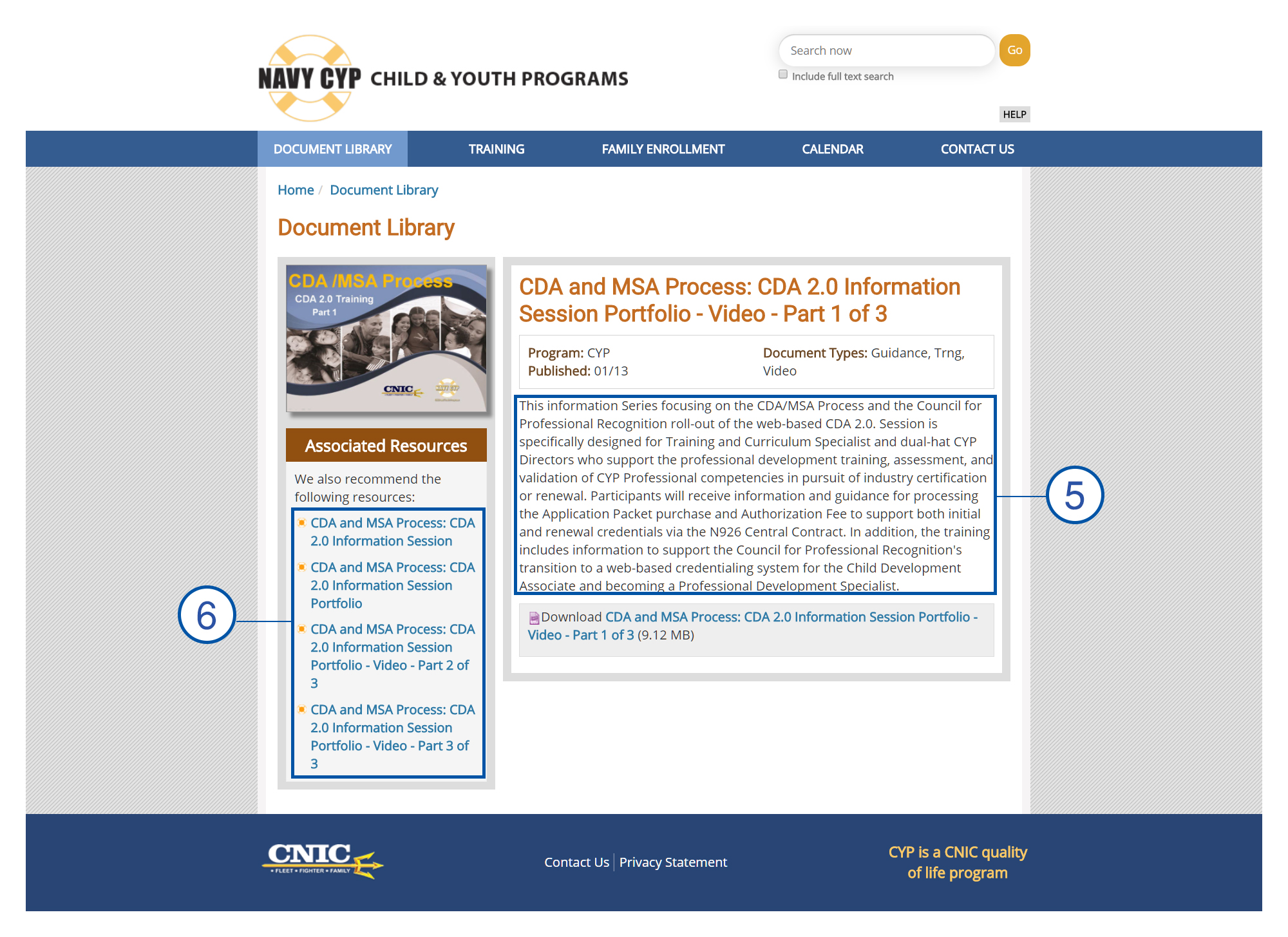
- This is just one big blob of text that adds little value to the design. Hotspots data of this page showed very few users looking at it, and why not. This text actually contains important information like what the video series contains, who it is meant for and what one can get out of it, but the way it is presented in very unattractive.
- This is the same blob of text as seen of the previous page. This means the user has to navigate to a different page to learn nothing new. The only thing that's new on this page is the download link below which allows the users to download the video series.
- Again, these links reference to the URL as 'Part 1,2,3,N' on the previous page, just rewritten as under different titles.
- (Not in picture) No way to sort the data by popularity, date uploaded
Page 1
Page 2
Comparative Analysis

Sketching
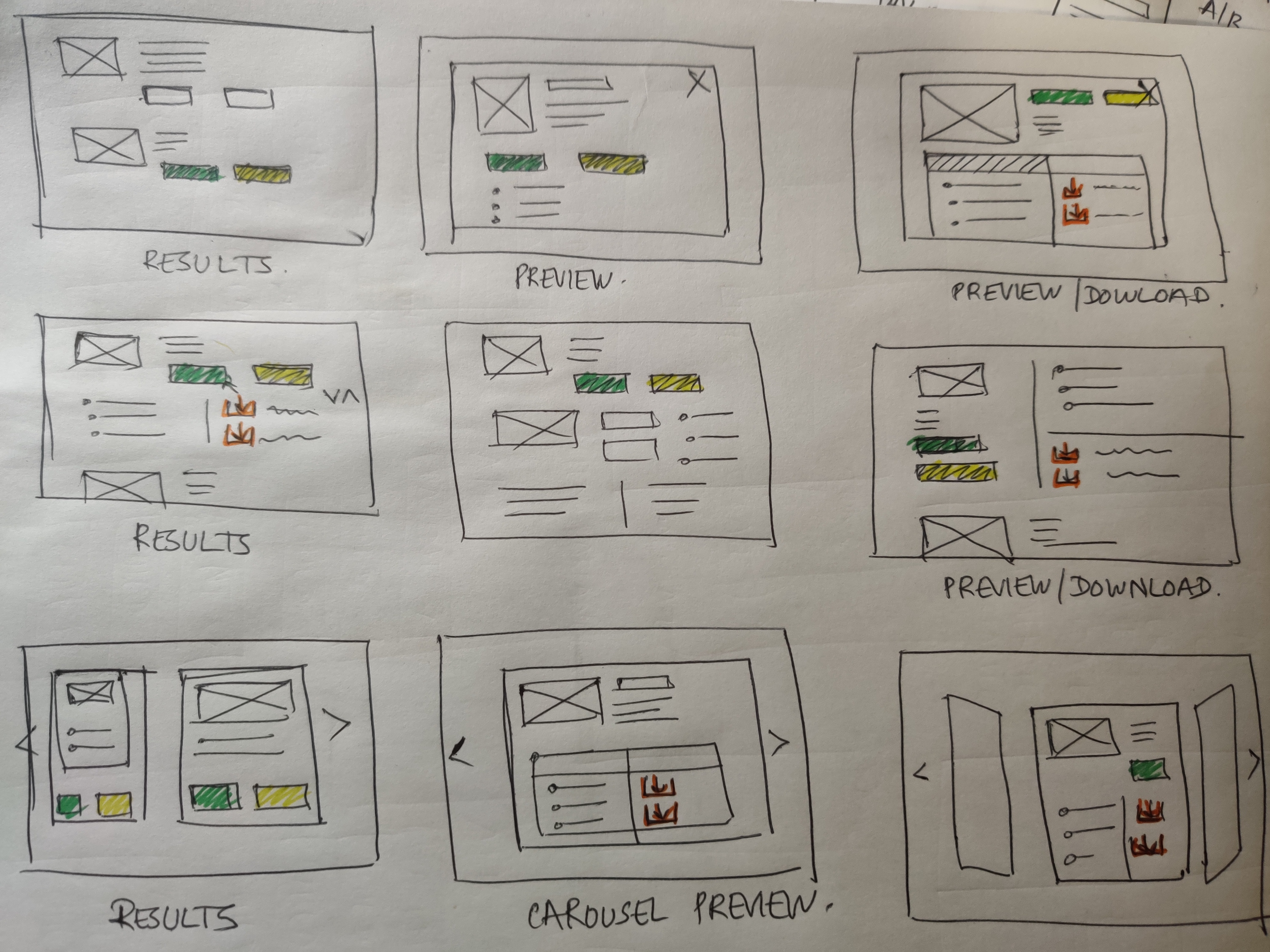
The Final Design
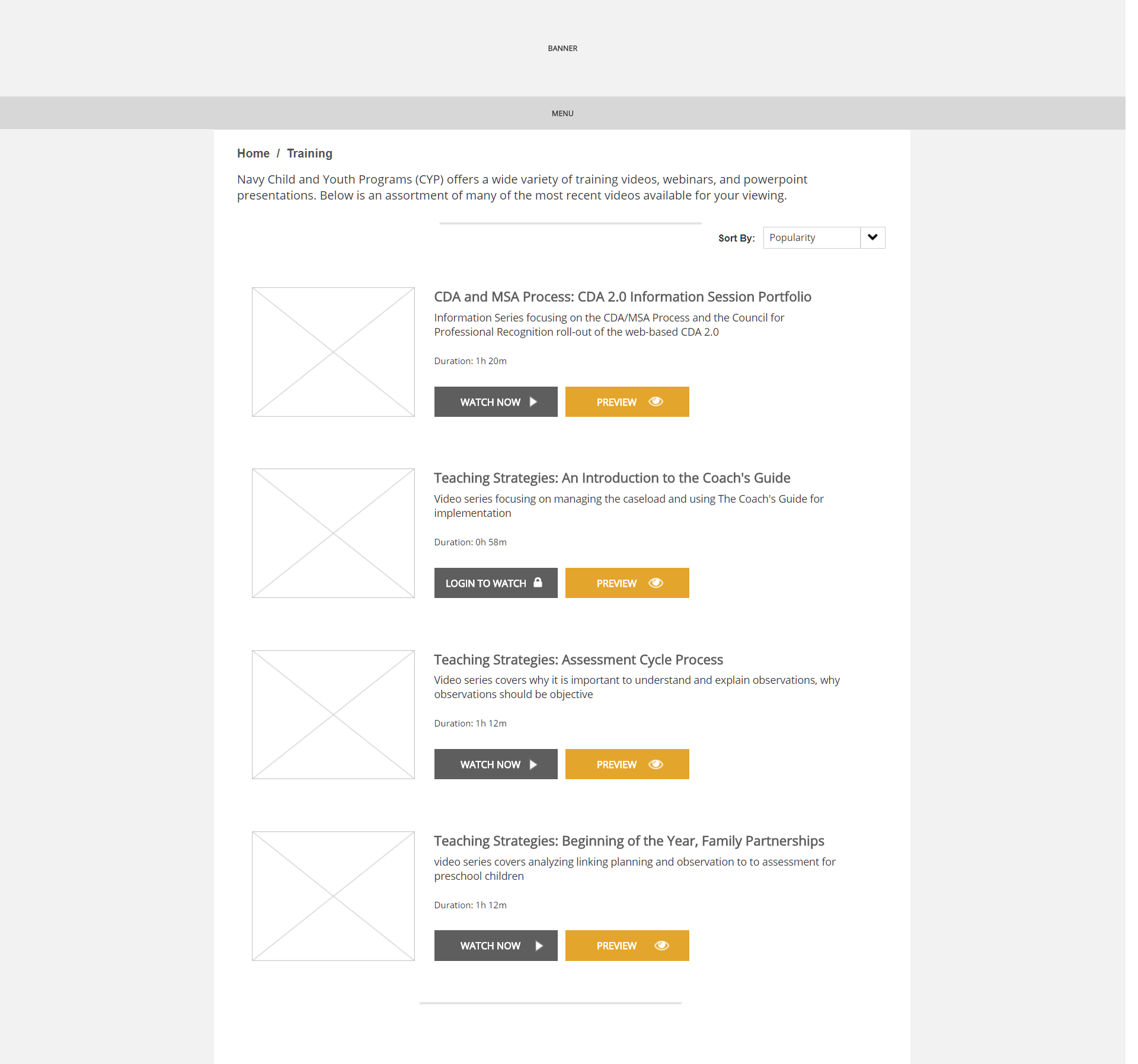
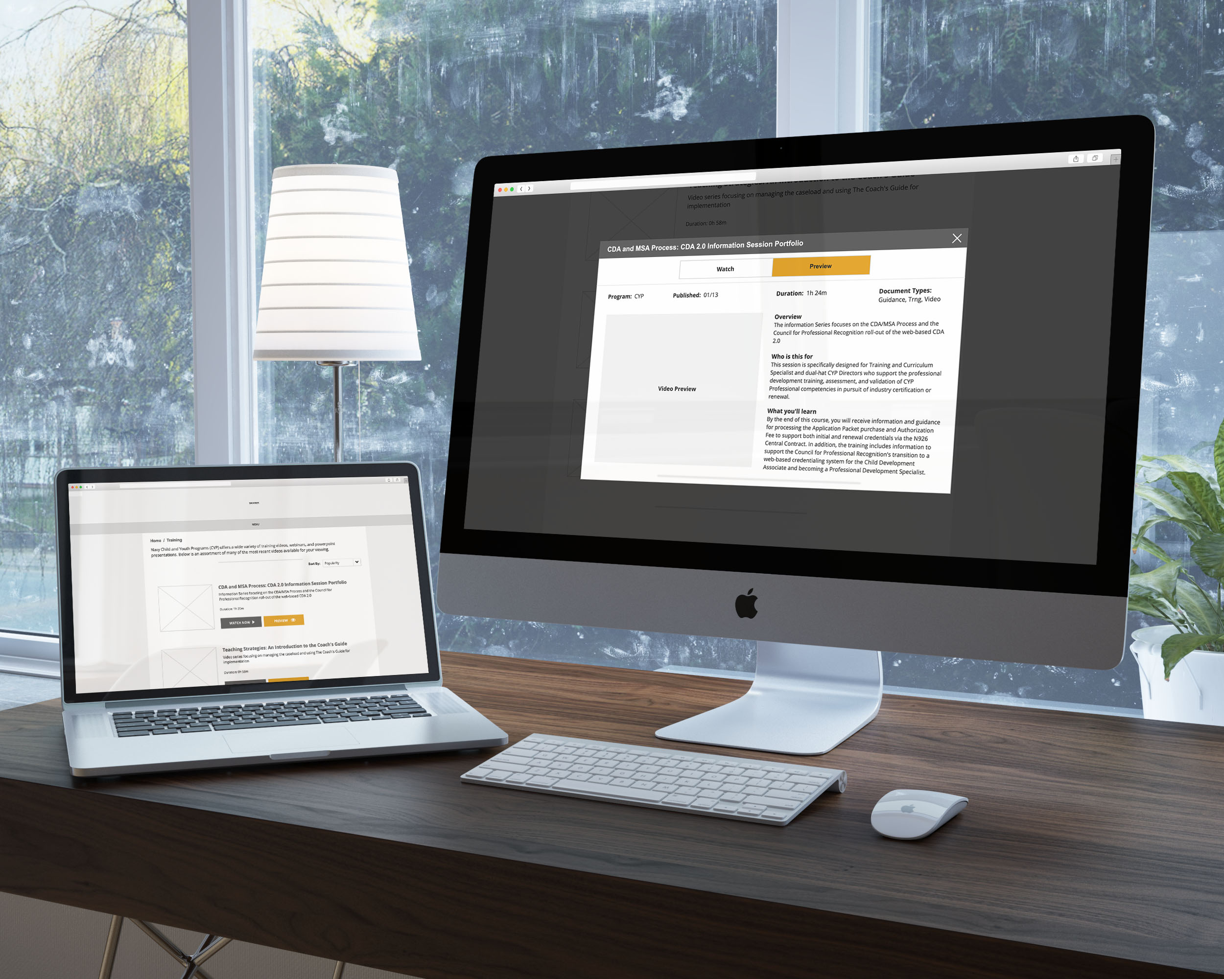
- The new design achieves everything (and more) in just a single page, unlike two pages for the old version
- Each card (or result) is of the same size and has the same content - an image, a title, a one-line description, duration and buttons to watch or preview the training
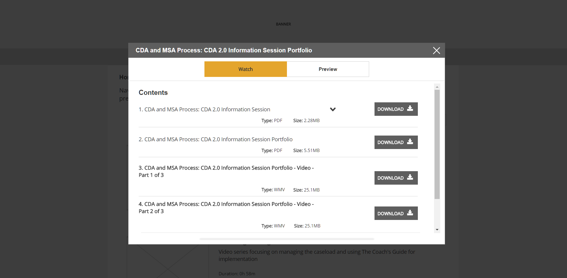
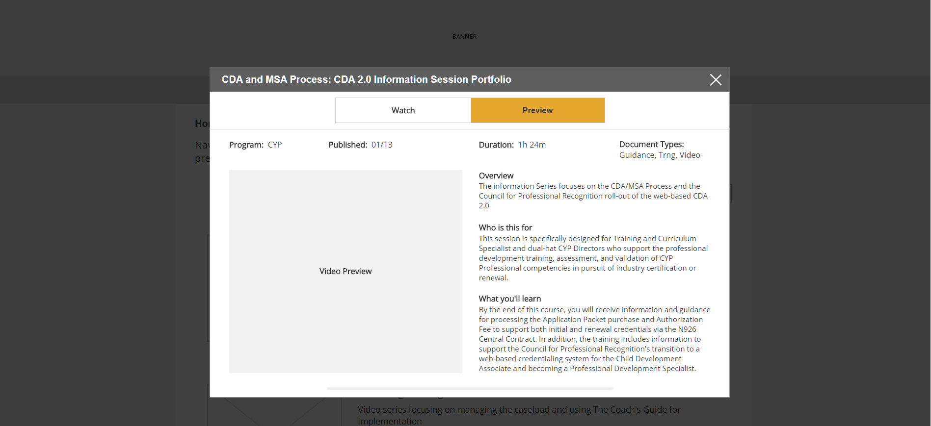
- The design satisfies two use cases: 1. The WATCH NOW button for users who know what they want and just want to start watching the videos 2. The PREVIEW button for users who want to learn more about the training - audience, duration and learnings.
- Users can see a demo video intro in PREVIEW or can switch to WATCH NOW and just download the videos. I also recommended they have a WATCH ONLINE option for users who have slow/limited internet speed for downloading, limited space on their computers.
- Sorting allows users to sort by DATE, POPULARITY, ALPHABETICALLY
- Also suggested they have distinguishable images for every card
- The design is 508 compliant and must be developed using WCAG and ARIA guidelines.