
TLDR - In this piece, I share my approach on building ever-lasting design systems in a comsulting setup. This approach is ideal for white-labelled products, products built as part of a contractual agreement (think consulting) or products built in a less UX-mature, dev-centric company.
We'll look at how you can onboard stakeholders to the idea of a design system, help them see value and work collaboratively with team members to build the many moving pieces involved while making them active contributors to the resource.
I teamed up with stakeholders at Department of Health and Human Services (HHS) - the country's largest federal healthcare organization (our client) and led efforts that aimed at bringing user-centricity to the organization's design and development practices.
One such effort included overhauling and revamping the UX of the client's existing product line with a specific focus on creating a one-stop shop experience for the complete family of products and delivering a unified, consistent user experience across all products. This was going to be the perfect opportunity to bring homogeneity in the products and embed order and discipline in the team's design practices.
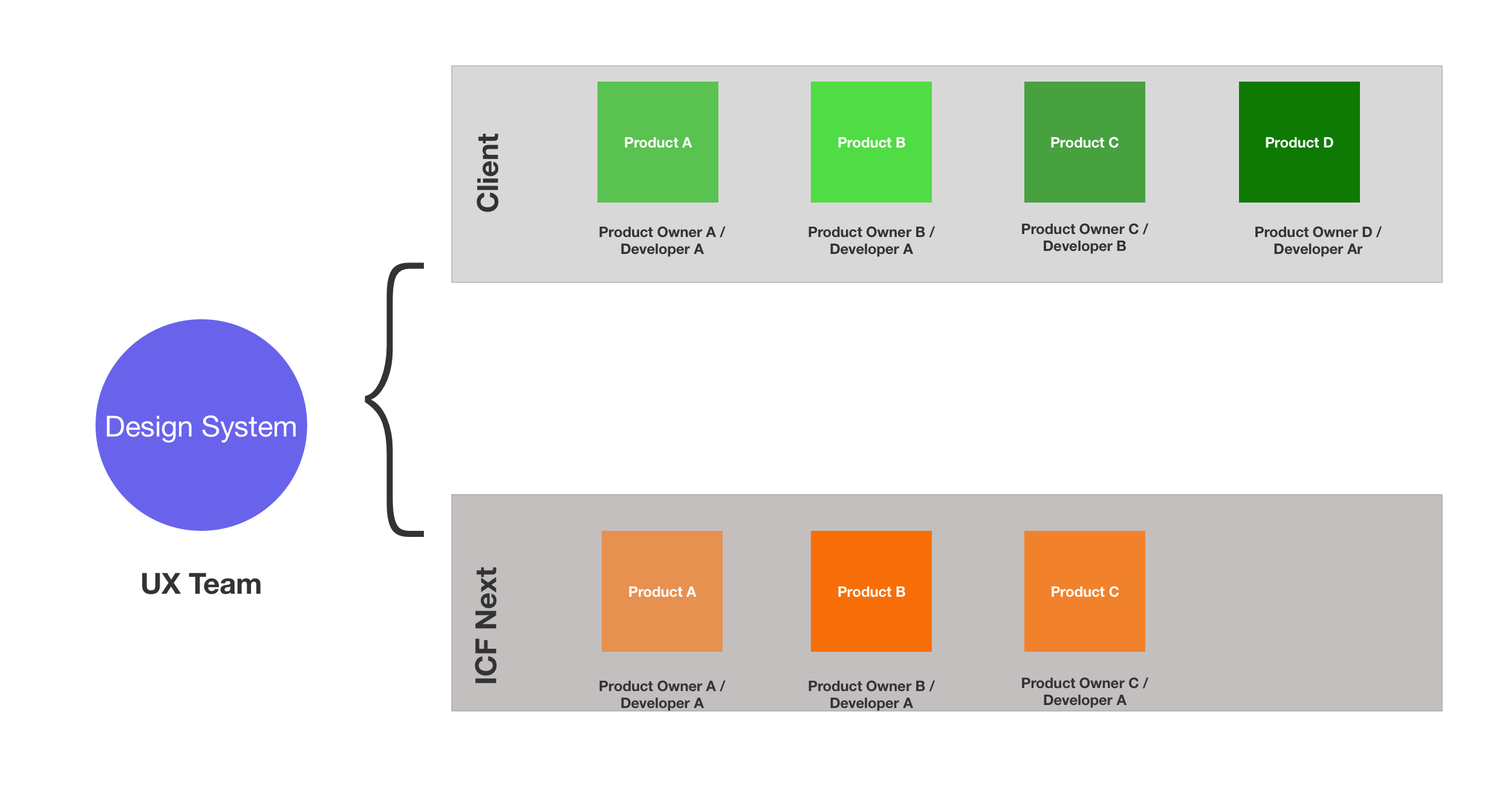
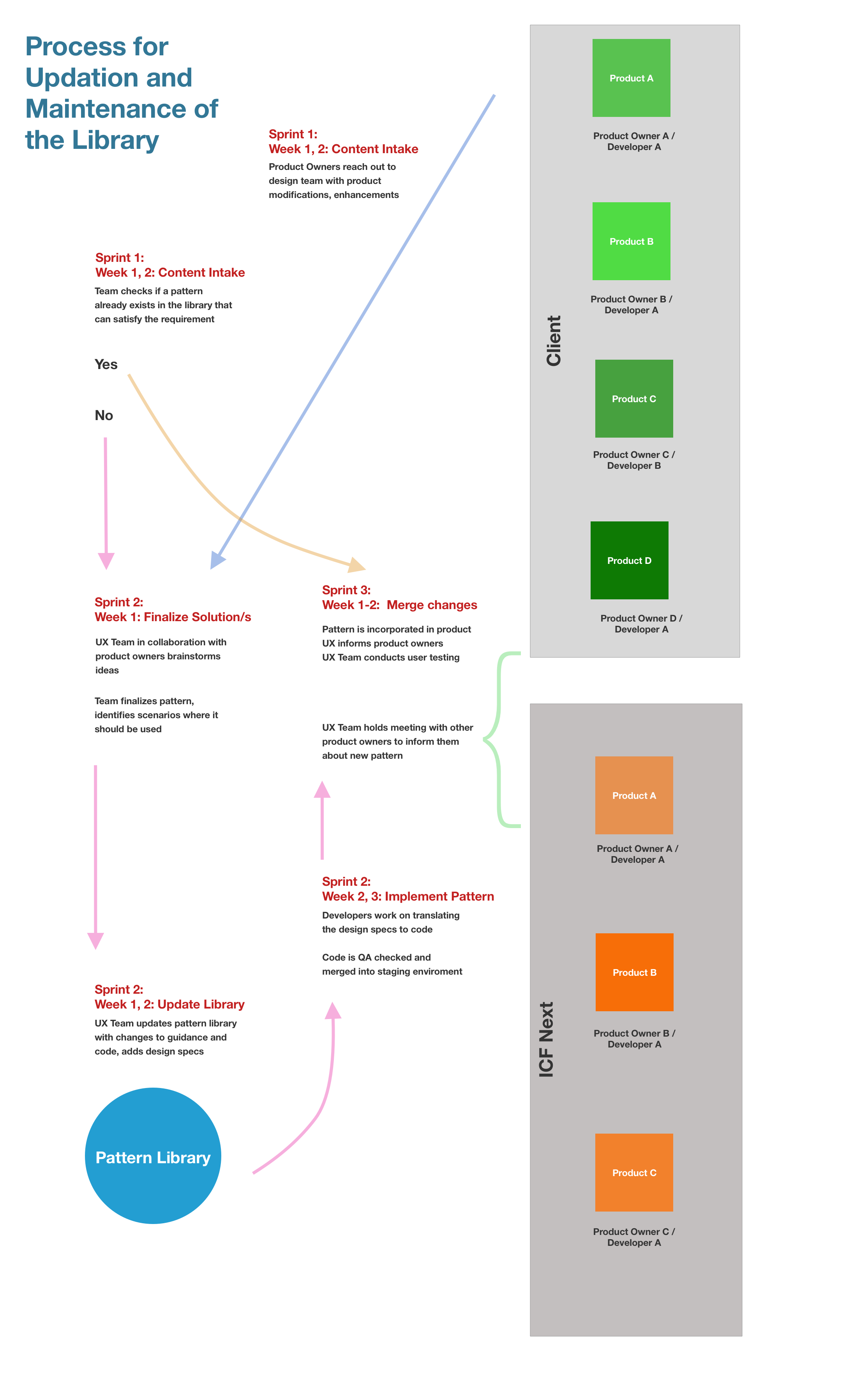
The diagram below shows the complete umbrella of products the library would impact, and how their ownership was divvied across the two organizations - the client and ICF (my company).
I started by presenting the idea of a design system to leadership; discussing the benefits and ROI, the timeline for creation, the input we'd need from stakeholders, and what changes we could expect not only in the products' UX but also the way things got designed, built and shipped. This boded well with the client and we got the approval to move to the next step — building the system itself.
The team members were product owners, analysts and developers. So, having worked with UI components before in some capacity they knew what UI constructs like 'color palette' and 'typography' meant but didn't necessarily understand the nuances — for example, the difference between a typefont and typeface.
So as the lead and only designer on this project, I realized it was important to educate and onboard them to these constructs and even before we got into design, highlight why we were even looking at them and underscore the importance of defining standards for each.
We followed a phased approach and built the library one component at a time. We started with the building blocks — the color palette, type styles, language, iconsets, layouts etc. and then moved to more complex components like UI components, templates, forms etc.
Each week we'd look at one component — evaluate its purpose, look at standards commonly followed by the design industry and discuss guidance that needs to go around it. We would then gauge where every product stood in terms of following the proposed standard and what each team would need to do to bring their product on par with the standard, for that component.
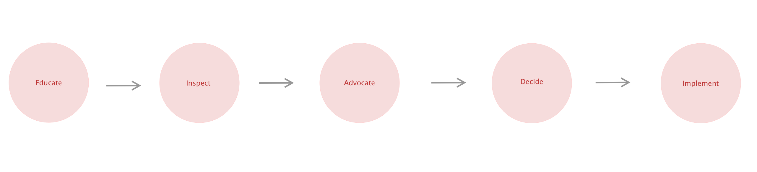
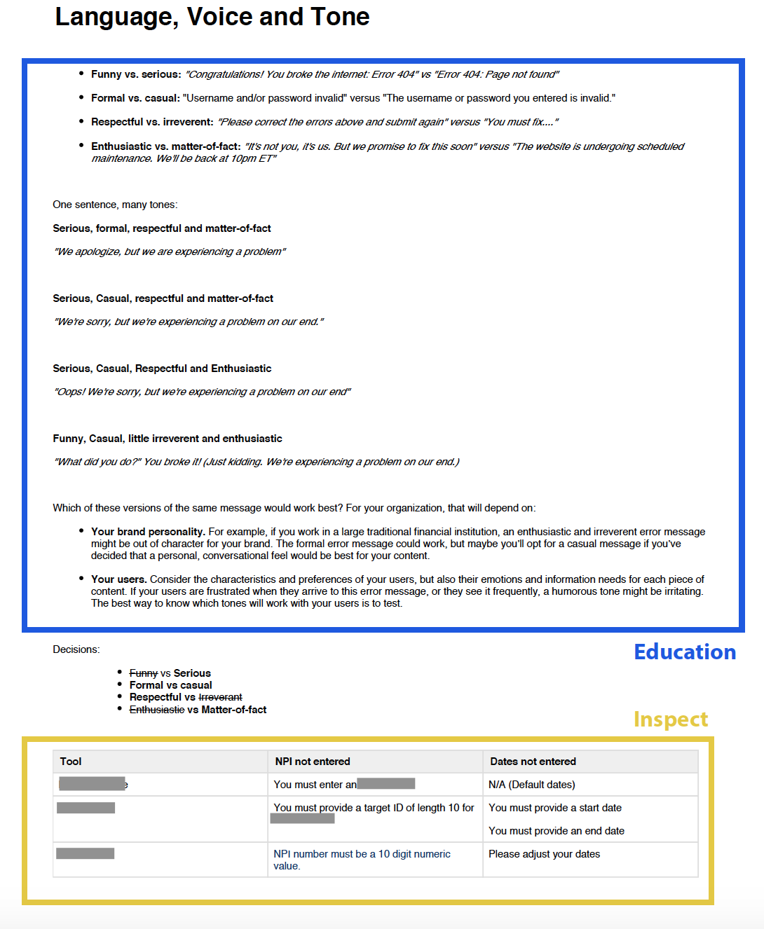
Educate: I kicked off each meeting by introducing the library component we were going to look at, describe its usage and the value it lends to the system and good practices around it.
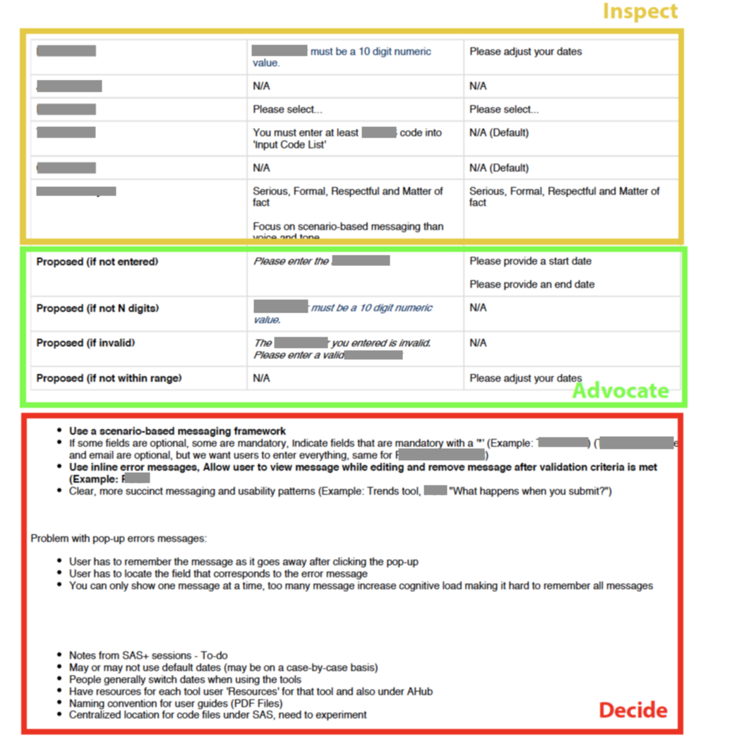
Inspect: The next step involved inspecting our product inventory for that component, evaluating the standards being followed and identifying discrepancies in component design and behavior. I would do this beforehand and have my observations logged on a confluence page.
Advocate: Based on my inspection, research around best practices for this component and knowledge of our user base, I'd propose standards that the team should follow.
Decide: I would then allow team members to raise concerns, ask questions and request for variations/deviations in the standard. Decisions were made following this, wherein all team members agreed to embrace and fold in this standard in the design system and subsequently, in their respective products.
Implement: This involved working with development teams to build this component out. I, as the designer, tasked myself with designing the component and including it in the design system with the necessary guidance.
Also, along the way, I realized that the clients preferred to see wireframes of how the proposed standards looked on their products and tweaked our approach to incorporate a 15-min demo of our design. And this makes sense, because just saying an H1 would be '36px' or showing an H1 in the form of a typescale is very different than actually showing how a '36px' H1 looks on a webpage.
Next, I'm going to give you a sliver of our design system and note some resources that helped us build it. If you think you already know the technical side of design systems you can skip to the last part — maintenance.
These were the topics we covered over the course of developing the library:
Color Palette
Our products were form-based, data-driven tools which used a considerable amount of data vis. So having a comprehensive set of primary and secondary colors was important. For guidance and color nomenclature we used https://www.colorbox.io/ by Lyft.
Layouts
Different users have different requirements for negative space and layouts can help users adjust the way information is condensed on the screen to align with the reading habits.
In our system, we provide two layouts — compact (less white space, larger margins, more dense content) and cozy (more white space, smaller margins, less dense content)
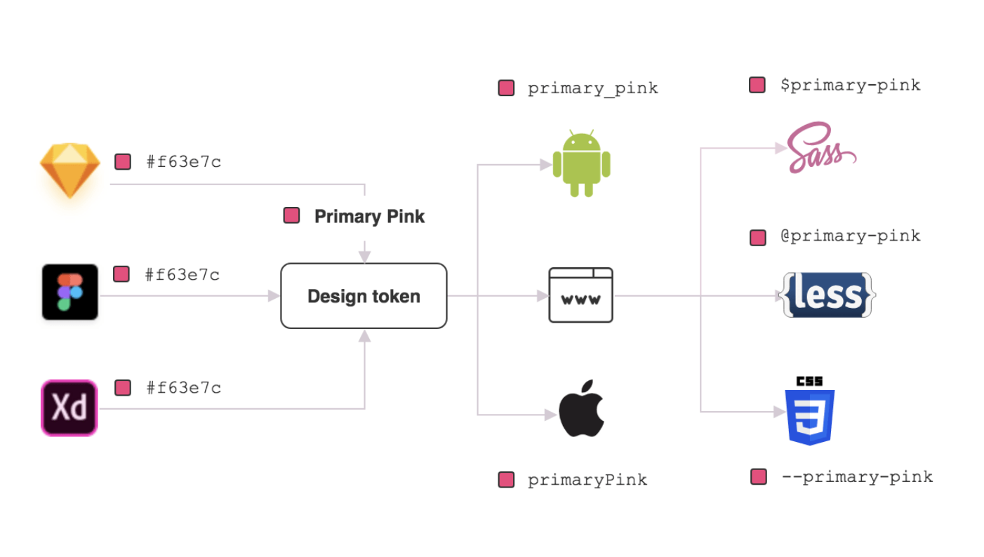
Design Tokens
I could see stakeholders referring to colors and text styles with various names and the team didn't seem to have a set nomenclature for components and variable. This necessitated the need for design tokens in our library, that went on help the team develop a common vocabulary to communicate ideas more effectively to team members.
Component Library
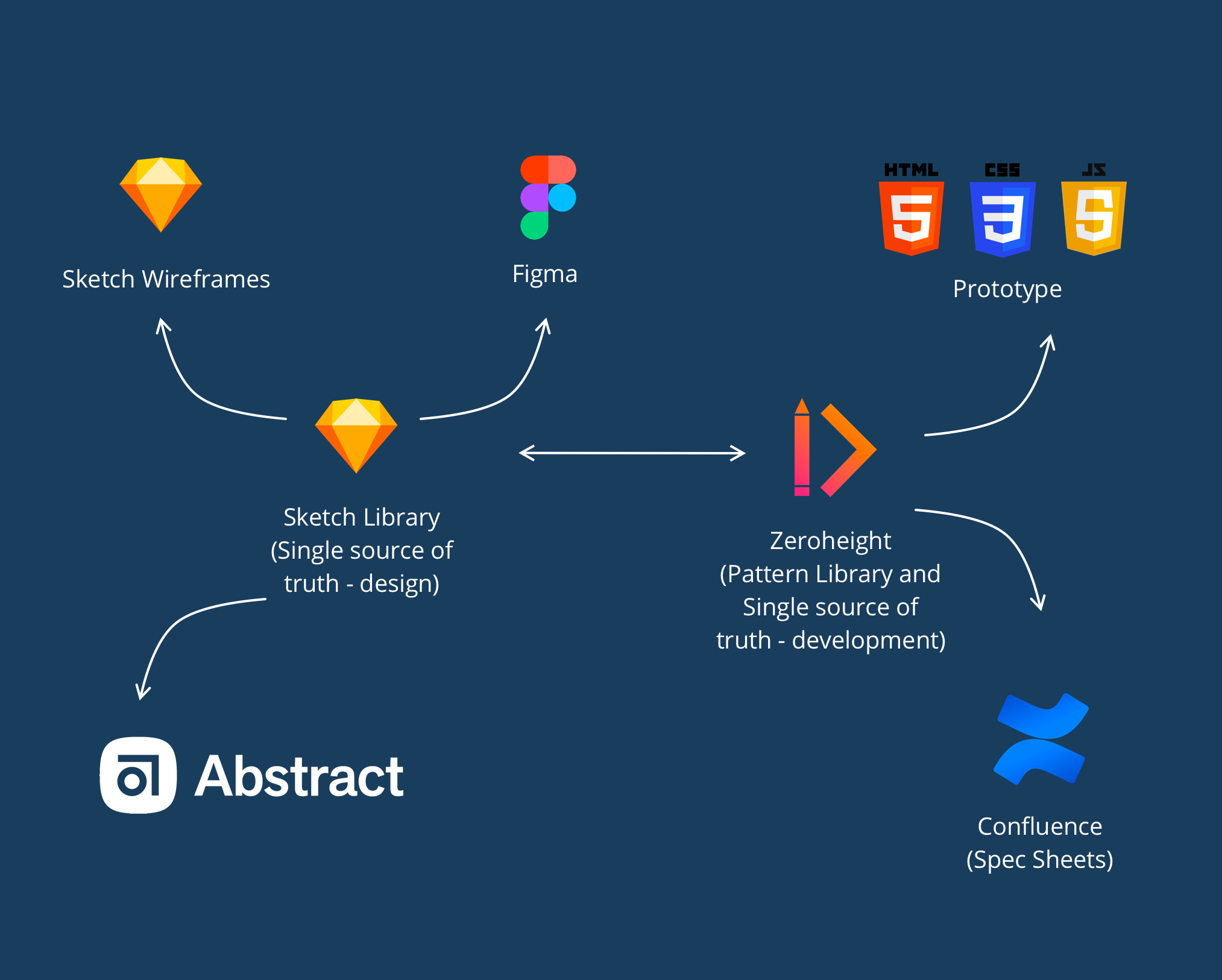
The component library consists of simple and complex interactive patterns and code snippets that can be used to build any page for any product. The designs coming from the Sketch file help bring consistency to design while the code snippets help bring consistency to code (IDs, classnames,coding style etc.)
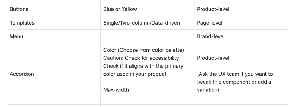
Even after we had defined the standards, we came across use cases when we would have to deviate from a standard for various reasons. Like we had a blue and a yellow primary button, in the library and depending on the background color for each tool, we had to pick which button we wanted to use. But that also meant, once a certain color button was selected, we had to stick with it and use it consistenctly across all pages of the tool. This also meant keeping the background color consistent. But how would the developers know this unless I specified this for each component? So introducing REACH.
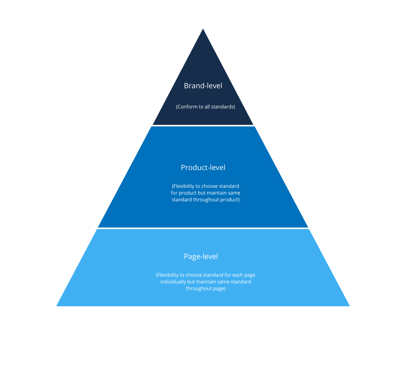
Depending on how complex your product is, you can define the reach. Our design system strings together an array of products that are web-based forms with 1—2 pages — so each product is a form with 1—2 pages and we have 7 such products in our ecosystem. So I defined three levels of reach for them -
1. Brand-level
Standard cannot be changed or tweaked once defined for the brand as a whole
2. Product-level
Can be tweaked for each product to align with product needs
3. Page-level
Can be tweaked for each page to align with page/information-needs
This is not a cookie—cutter solution and you can define more levels depending on how complex your product is — like module-level, section-level, feature-level etc.
Now that I had my reach—level, it was time to map them to every standard we had in the library.
Before diving into this, I would suggest you see this anecdote from Brad Frost from his talk titled 'Technical Side of Design Systems' from CSS Day 2019.
Drawing a parallel from the leaking roof example, every time there's a need to use a UI pattern to handle new data or information on a page, look at what you already have in the library. If there's a pattern that fits the bill, go ahead and use it while conforming with the guidelines for recreating that pattern.
If there's isn't an exact match, see if you can use an existing pattern with minor tweaks (and of course if you're doing this test it!) If there still isn't a match, introduce a new pattern. So that's how we maintain and update our library.
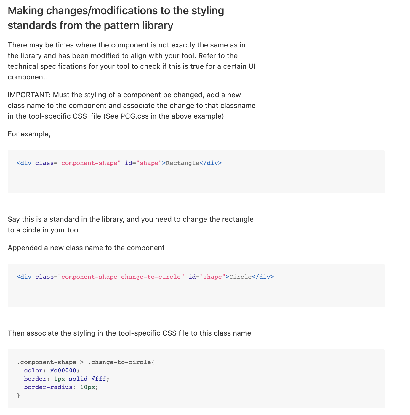
Due to the use of design tokens and a single source of truth, which had all the default classnames and IDs of components (which gave the components their look and behavior), it was very important that these names were not overrriden at any point without the consent of the design team. Hence, it was necessary to specify rules for developers to make changes to the code snippets/design standards.
This section involves wireframes and prototypes protected by NDA. Let's get on a call to discuss this.
I used number of commits by developers (before the library was created) versus (after the library was put to use) as a metric to calculate the impact the library has had. Let's get on a call to discuss this in detail.